The Optical Illusion That’s So Good, It Even Fools DanKam
We’ll return to the DNSSEC Diaries soon, but I wanted to talk about a particularly interesting optical illusion first, due to it’s surprising interactions with DanKam.
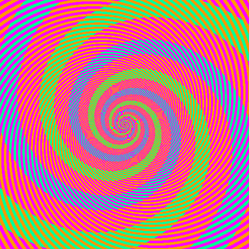
Recently on Reddit, I saw the following rather epic optical illusion (originally from Akiyoshi Kitaoka):
What’s the big deal, you say? The blue and green spirals are actually the same color. Don’t believe me? Sure, I could pull out the eyedropper and say that the greenish/blue color is always 0 Red, 255 Green, 150 Blue. But nobody can be told about the green/blue color. They have to see it, for themselves:
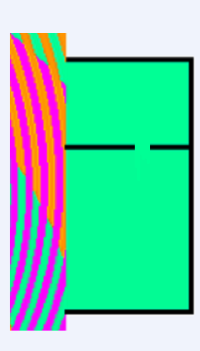
(Image c/o pbjtime00 of Reddit.)
So what we see above is the same greenish blue region, touching the green on top and the blue on bottom — with no particular seams, implying (correctly) that there is no actual difference in color and what is detected is merely an illusion.
And the story would end there, if not for DanKam. DanKam’s an augmented reality filter for the color blind, designed to make clear what colors are what. Presumably, DanKam should see right through this illusion. After all, whatever neurological bugs cause the confusion effect in the brain, certainly were not implemented in my code.
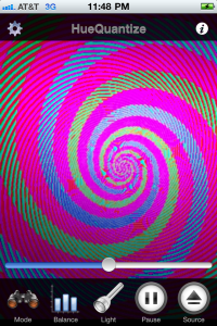
Hmm. If anything, the illusion has grown stronger. We might even be tricking the color blind now! Now we have an interesting question: Is the filter magnifying the effect, making identical colors seem even more different? Or is it, in fact, succumbing to the effect, confusing the blues and greens just like the human visual system is?
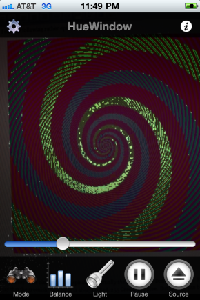
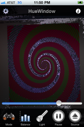
DanKam has an alternate mode that can differentiate the two. HueWindow mode lets the user select only a small “slice” of the color spectrum — just the blues, for example, or just the greens. It’s basically the “if all else fails” mode of DanKam. Lets see what HueWindow shows us:
The orange stripes go through the “green” spiral but not the “blue” one. So without us even knowing it, our brains compare that spiral to the orange stripes, forcing it to think the spiral is green. The magenta stripes make the other part of the spiral look blue, even though they are exactly the same color. If you still don’t believe me, concentrate on the edges of the colored spirals. Where the green hits the magenta it looks bluer to me, and where the blue hits the orange it looks greener. Amazing.
The overall pattern is a spiral shape because our brain likes to fill in missing bits to a pattern. Even though the stripes are not the same color all the way around the spiral , the overlapping spirals makes our brain think they are. The very fact that you have to examine the picture closely to figure out any of this at all shows just how easily we can be fooled.
See, that looks all nice and such, but DanKam’s getting the exact same effect and believe me, I did not reimplement the brain! Now, it’s certainly possible that DanKam and the human brain are finding multiple paths to the same failure. Such things happen. But bug compatibility is a special and precious thing from where I come from, as it usually implies similarity in the underlying design. I’m not sure what’s going on in the brain. But I know exactly what’s going on with DanKam:
There is not a one-to-one mapping between pixels on the screen and pixels in the camera. So multiple pixels on screen are contributing to each pixel DanKam is filtering. The multiple pixels are being averaged together, and thus orange (605nm) + turquoise (495nm) is averaged to green (550nm) while magenta (~420nm) + turquoise (495nm) is averaged to blue (457nm).
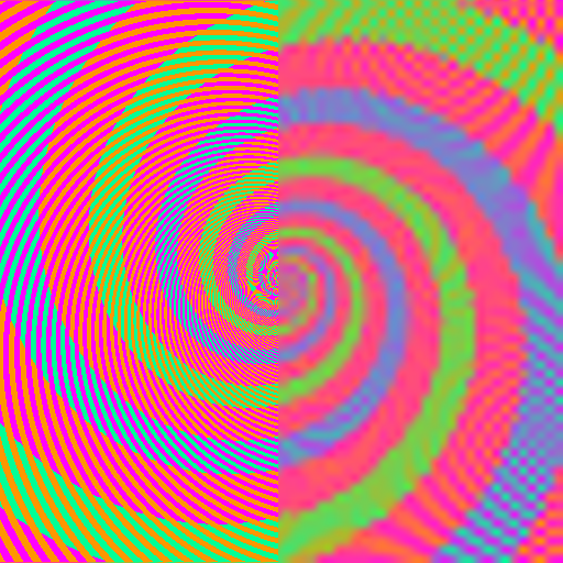
There is no question that this is what is happening with DanKam. Is it just as simple with the brain? Well, lets do this: Take the 512×512 spiral above, resize it down to 64×64 pixels, and then zoom it back up to 512×512. Do we see the colors we’d expect?
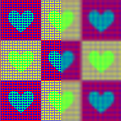
Indeed! Perhaps the brightness is little less than expected, but without question, the difference between the green and blue spirals is plain as day! More importantly, perceived hues are being recovered fairly accurately! And the illusion-breaking works on Akiyoshi Kitaoka‘s other attacks:
[YES. SERIOUSLY. THE HEARTS ARE ACTUALLY THE SAME COLOR — ON THE LEFT SIDE. THE RIGHT SIDE IS WHAT YOUR VISUAL SYSTEM IS REPORTING BACK.]
So, perhaps a number of illusions are working not because of complex analysis, but because of simple downsampling.
Could it be that simple?
No, of course not, the first rule of the brain is it’s always at least a little more complicated than you think, and probably more 🙂 You might notice that while we’re recovering the color, or chroma relatively accurately, we’re losing detail in perceived luminance. Basically, we’re losing edges.
It’s almost like the visual system sees dark vs. light at a different resolution than one color vs. another.
This, of course, is no new discovery. Since the early days of color television, color information has been sent with lower detail than the black and white it augmented. And all effective compressed image formats tend to operate in something called YUV, which splits the normal Red, Green, and Blue into Black vs. White, Red vs. Green, and Orange vs. Blue (which happen to be the signals sent over the optic nerve). Once this is done, the Black and White channels are transmitted at full size while the differential color channels are halved or even quartered in detail. Why do this? Because the human visual system doesn’t really notice. (The modes are called 4:2:2 or 4:1:1, if you’re curious.)
So, my theory is that these color artifacts aren’t the result of some complex analysis with pattern matching, but rather the normal downsampling of chroma that occurs in the visual system. Usually, such downsampling doesn’t cause such dramatic shifts in color, but of course the purpose of an optical illusion is to exploit the corner cases of what we do or do not see.
FINAL NOTE:
One of my color blind test subjects had this to say:
“Put a red Coke can, and a green Sprite can, right in front of me, and I can tell they’re different colors. But send me across the room, and I have no idea.”
Size matters to many color blind viewers. One thing you’ll see test subjects do is pick up objects, put them really close to their face, scan them back and forth…there’s a real desire to cover as much of the visual field as possible with whatever needs to be seen. One gets the sense that, at least for some, they see Red vs. Green at very low resolution indeed.
FINAL FINAL NOTE:
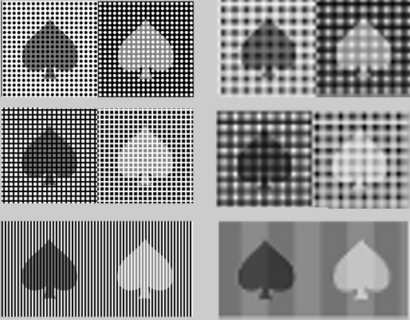
Just because chroma is downsampled, with hilarious side effects, doesn’t mean running an attack in luminance won’t work. Consider the following images, where the grey spade, seems to not always be the same grey spade. On the left, is Kitaoka’s original illusions. On the right, is what happens when you blur things up. Suddenly, the computer sees (roughly, with some artifacts) the same shades we do. Interesting…
A SLIGHT BIT MORE SPECULATION:
I’ve thought that DanKam works because it quantizes hues to a “one true hue”. But it is just as possible that DanKam is working because it’s creating large regions with exactly the same hue, meaning there’s less distortion during the zoom down…
Somebody should look more into this link between visual cortex size and optical illusions. Perhaps visual cortex size directly controls the resolution onto which colors and other elements are mapped onto? I remember a thing called topographic mapping in the visual system, in which images seen were actually projected onto a substrate of nerves in an accurate, x/y mapping. Perhaps the larger the cortex, the larger the mapping, and thus the stranger ?
I have to say, it’d be amusing if DanKam actually ended up really informing us re: how the visual system works. I’m just some hacker playing with pixels here… 😉

So how can you know that DanKam is getting the same effect? Isn’t it possible that DanKam is getting a different effect, but since the only way you can perceive it is through your brain, your brain is getting the same effect, not DanKam?
A lot of this is going over my head 😦
Reasonable questions. We learn a lot about the visual system by working through illusions though…
Very cool. Love the analysis!
I believe what DanKam is accomplishing through downsampling is only somewhat conincidentally the same as what the brain is doing in its attempt to compensate for variations in lighting conditions. As you know, the color of natural light itself varies, and light often does not fall evenly on a scene, so the visual system has multiple methods of compensation and correction so that objects will have a consistent appearance despite these variations.
One of the main techniques used for this is called “Center/Surround”. A point’s color or brightness is not determined by its “absolute value” if you will, but rather its difference from an average of all the colors in an area around it. (Of course, there are other systems to compensate for some of the obvious failure modes of this system.) There are lots and lots of illusions where the same absolute color appears different because of different surroundings.
I highly recommend the book “Vision and Art” by Margaret Livingstone for more information. She has put together a book filled with beautiful examples as well as clear explanations of how the features of the visual system that for the most part help us process visual information occasionally lead us astray (and how, as a visual artist, you can use that to your advantage).
It’s awfully coincidental.
How would you design a test to differentiate between topographic downsampling and center/surround?
Consider the illusion shown here: http://www.v7consulting.com/1/pages/optical-illusion9.htm
It can be described as a series of evenly spaced black squares on a white background or a white grid on a black background. Following the latter description, due to center/surround processing the intersections of the white grid lines appear darker than the rest of the white lines. If you downsample it, however, you’d expect the intersections to appear lighter, if anything.
Hmmm. What do you think about this?
Simple downres/upres using smoothing: http://imgur.com/QhcKu.jpg
Note how the white line intersections are lighter than the rest of the line. You might need to measure it since this still triggers the illusion.
http://imgur.com/owL27.png shows some kind of center/surround effect or something like it. I don’t know why the border goes to black.
I wonder if your hitting some kind of auto-white-balance algorithm in the iPhone.
Looks like you just gaussian blurred a white-squares-on-black grid then overlayed it with the black square grid. What did you do to get this image?
for what it’s worth, as a colorblind person, this part: https://dakami1.files.wordpress.com/2010/12/cropped.png seemed rather obvious to me.
how do you normal color viewers see it?
David,
Pretty much that. My point is that the output looks awfully like the experienced illusion.
I had always wondered how this difference in resolution between chroma and luminance detectors in the eye actually affected what we see (before the brain kicks in and puts everything into one coherent picture). I know now. Thank you!
matthias–
Just be aware this is my theory, and not actually consensus 🙂
As a colorblind artist I see the optical illusions in the same way that 24 frames per second fools the brain into fluid motion.
OK, I’m not colorblind, but I have to say that this is by far the coolest thing I’ve ever seen. I’ve known a number of people who are colorblind, and the average reaction from most people is disbelief. They can’t understand how someone can’t see a particular color, or the difference between colors. I’ve also seen a lot of teasing about this. I find it akin to picking on a blind person. Great work, and great app. (I know this isn’t on the original app page, but this is where I first saw it, and I think it is marvelous.)
If I get my face really close to the computer screen, I do see the blue and green as the same colour.